 Trying to figure out how to pick paint colors for your home and feeling a little overwhelmed by all the choices? This step-by-step guide walks you through the entire process. So you can feel confident that you’re going to love your interior paint colors for years to come!
Anyone else ever found themselves standing in a paint store, staring at the approximately five billion choices and wondering how in the heck you’re going to pick one? Yup. Me too!
Even as someone in the home design field, I still get overwhelmed if I just head over to the paint swatches section cold turkey. (I’ve even been known to make some questionable paint color selections. Read on for that particular tale of woe.)
But before we even jump into my tips, I’ll tell you that the number one thing you can do to ensure you pick the best paint colors for YOUR house. You have to narrow down what you want – and don’t want – before ever setting foot in a paint store.
Ready to get started? I know I am!
Note that for this step-by-step guide, I’m assuming you want to pick out a few colours for your home. But my tips still work if you’re planning on only picking one color. Or if you want to pick out colors for your whole home.
Watch the Video!
How to Pick Paint Colors Step 1: Pre-Planning
As in so many areas of life, pre-planning is the most important step when choosing interior paint colors for your home. Not surprising that it’s the step most of us least like doing.
Even if you’re an obsessive planner like me, we often skip right over this stage when picking inside paint colors for our house. Because step one is obviously going to a paint store and picking out a ton of swatches… right?
Wrong!
The number one reason it’s so hard to choose interior paint colors for your home is because there are about a million choices. And I’m not exaggerating.
If you consider the amount of paint brands there are, plus the amount of colors each brand offers – it’s truly mind numbing.
So the first thing you need to do is narrow down your choices so it doesn’t seem so overwhelming. Here are the three things you need to do BEFORE heading to the paint store.
Choosing a Paint Brand
The first way to narrow down your choices is to choose a brand. If you’re trying to decide between the thousands upon thousands of colors across all available brands you can pretty much guarantee overwhelm is going to set in.
Benjamin Moore and Sherwin Williams are both very well-known and well-respected brands in the interior design world because of their quality and durability. I also like these brands because they each have an eco-conscious, zero-VOC paint line.
If you want to check out brands that are specifically known for their eco-responsibility, then try Farrow and Ball and ECOS. The only reason I don’t automatically recommend them is because depending on where you live, they may not be as readily available. But if you have access to Farrow and Ball and ECOS – they’re absolutely worth looking in to!
Choosing Color Families
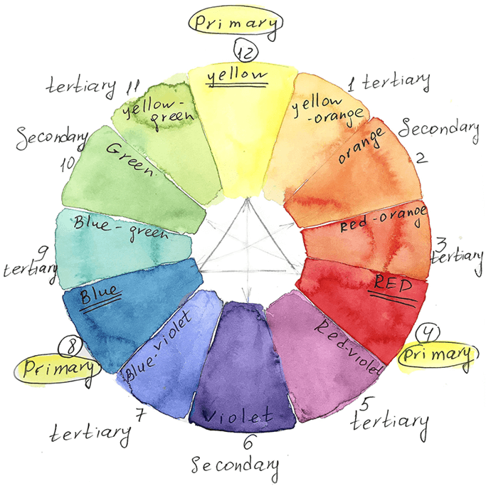
I once read that even though there are thousands of options in a paint store, there really are only three primary colors and three secondary colors. Meaning yellow, orange, red, purple, blue and green. All the other colors are just variations on these six. Once you realize that, the choices seem much more manageable because you likely can cut out thousands of choices.
Start by taking note of the decor you already have. What colors continuously show up? (For me it’s green, green and more green.) As for furniture, what kind of wood tones do you see around your home? Do they have warmer undertones (meaning red, yellow and orange)? Or do you gravitate toward non-wood or painted furniture?
Next, think about the colors you DON’T like. For example, I very much prefer the blue-green-yellow side of the color wheel than the orange-red-purple. Knowing what you don’t like before heading to the paint store is just as important as knowing what you do like. Maybe even more so!
Choosing Neutrals
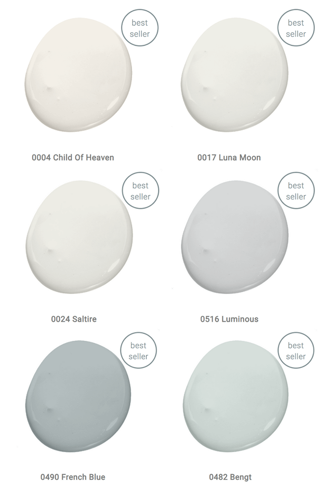
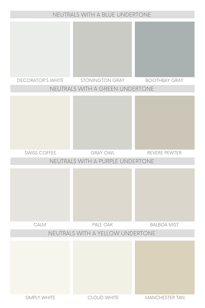
Of course, those six colors mentioned above don’t include neutrals such as white, beige, grey, brown and black. And yet… the thing about neutrals when it comes to paint colors is that they are never going to be truly “neutral.” There’s always going to be an undertone.
This is where the work you did narrowing down the color families you like is going to help. If you love colours like yellow, orange and red, you most likely are going to want a warm neutral such as a creamy off-white, beige or brown. If you like cooler colors such as purple, blue and or green, you probably would prefer a cool-toned neutral.
If what you really like as far as neutrals go is as pure white and as pure black as you can get, then you’re going to want to pick colors with as little undertone as possible.
How to Pick Paint Colors Step 2: Picking Out Paint Samples
Now that you’ve narrowed down your choices to one brand, one or two colour families and one neutral – NOW you can go to the paint store.
The Importance of Undertones
Using myself as an example, my favourite color family is green. And – not surprisingly – I also like a green-toned neutral. So at the paint store I’m going to look at the green swatches. I’m going to observe the undertones that are showing up in the store. (The undertones that you see in the store might not be what you see in your own space. Which is why you need to bring the paint swatches home.)
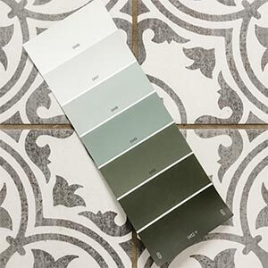
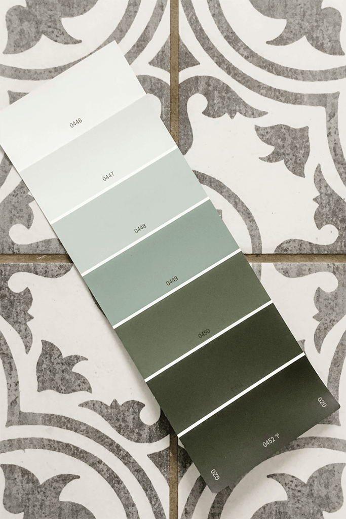
The great thing about the way most paint swatches are presented is that they’re on a strip with lighter colors on the top and darker on the bottom. If you find you like a color in the middle of the strip, check out what the lighter and darker version looks like. If you don’t like them too, you probably aren’t going to be happy with the mid-toned color either.
Find two or three paint color strips where you like ALL the colors. Maybe you aren’t going to paint the crazy-dark or almost-white colors on your walls, but you at least should be thinking “yup, those are all pretty nice.”
How Many Colors Should You Pick?
If you’re only picking out colors for one room, then of course you only need one – maybe two at most – colors. If you pick two you would use the darker colour for an accent wall. Or maybe paint the lower half of the wall darker and upper half lighter. (This works really well if you have wainscotting or some other type of panelling on the bottom portion of the wall.)
If you’re painting a few rooms or maybe an entire level of your home, then I would say choose two to four colors. Though it does depend on the size of your home.
Choosing one or two neutrals and one or two colours works well. As does choosing multiple shades from the same color family, i.e.: a very light green, a medium green, a dark green, etc.
Choosing a Whole Home Paint Palette
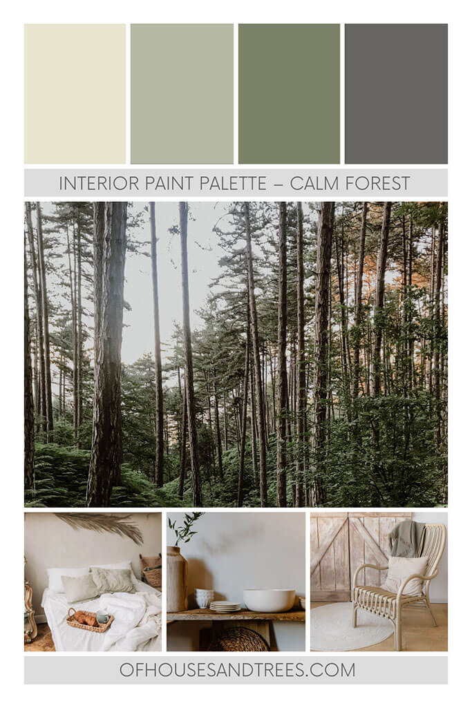
If you’ve built a new home or are repainting your entire house, I would recommend choosing anything from four to eight colours maximum. I’ve seen some whole home paint palettes that have twelve colors and I personally feel that’s too many. You want to have a sense of flow and this is done by certain colours repeating throughout the home and creating continuity.
Aiming for a happy medium between the four to eight range, if you were two choose six colors there should be at least one lighter neutral, three light to medium toned shades, plus two darker shades for accent walls.
I would also say choosing a few more color families would be a good idea because then you’ll have variety to play with. So, as much as I love green, when I repaint my home I’m planning on doing a black feature wall and also bringing in a navy blue and a dusty rose for my daughters’ rooms.

How to Pick Paint Colors Step 3: Testing Out Paint Colours
Step 3 is actually a two step process and involves you using the paint swatches to narrow your choices further. Then you can head back to the store to buy samples of paint. But I promise you it will be worth it. And to illustrate that I’m going to tell you a story.
Why You HAVE to Use a Bigger Sample Swatch
When we were building our house, the builder asked me to pick out paint colors for our home. No problem, I thought to myself. I’m just going to pick one color – a nice, neutral grey. So off to the paint store I go (so much for pre-planning) and I pick out a bunch of random grey samples.
I take them to the construction site and cut out the tiny little swatches. I stick a few of them on the wall in one of the rooms. I pick one, tell the builder the colour name. When I return to the construction site a week later guess what? It looked PURPLE. (See what I mean about undertones.)
If I had taken my own advice, I would have realized the grey had a purple undertone. And I would never have chosen it. And I would not be living two years later in a house painted with a colour I dislike. Though I’ve learned to live with it for the most part. (In my defense, when I picked the purplish-grey, I was exhausted from the build. I also distinctly remember I was sick at the time. Meaning I didn’t give the choice the same time and care I normally would have. Lesson learned!)
Using Sample Cans to Test Your Colors
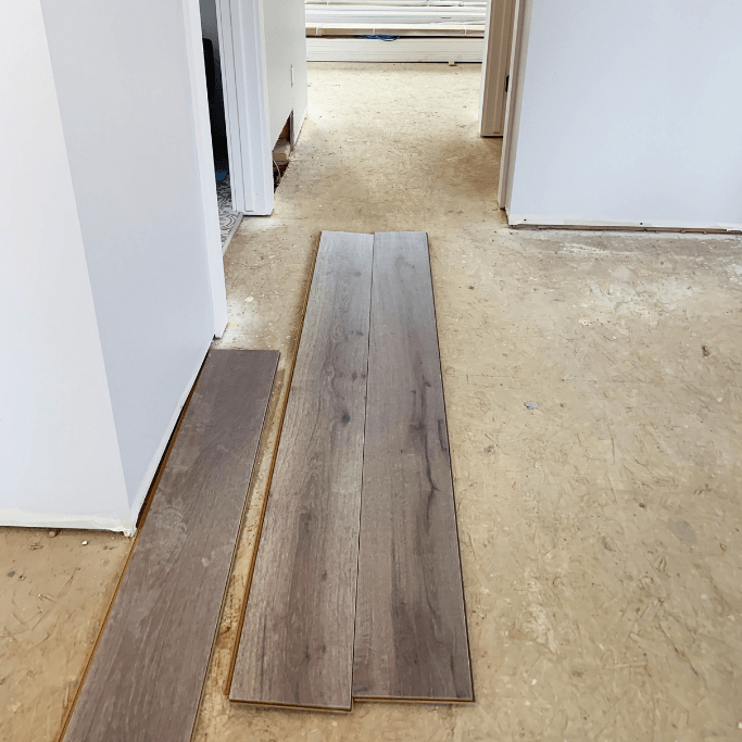
After you’ve used the swatches to narrow your choices further, you’re going to head back to the store and buy sample-sized paint cans.
To save money – and the environment – I recommend only buying sample cans for colors you’re pretty much sold on. Think of it as double-checking what you’re pretty sure you already know.
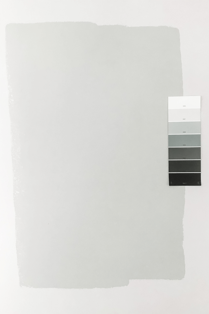
You can cut out pieces of cardboard at least 1’x1′ in size – but bigger is better. Then you can paint them with several coats of your sample colors. Move the sample boards around your home and note what they look like in different rooms and at different times of the day. And thanks to companies like Samplize, you can buy peel and stick paint samples that can easily be moved around again and again.
The Importance of Lighting
Lighting is the single most important factor that influences a paint color. This is why swatches don’t look the same in your home as they do in the store. This is also why you might love a color your friend has on their walls. But it doesn’t look the same on yours.
You might even like a certain color, but only in a certain room. Or maybe it looks good in daylight, but not under artificial light. Interior paint colors can even look different depending on the color temperature of your lightbulbs. Which can be warm or cool just like the paint itself.
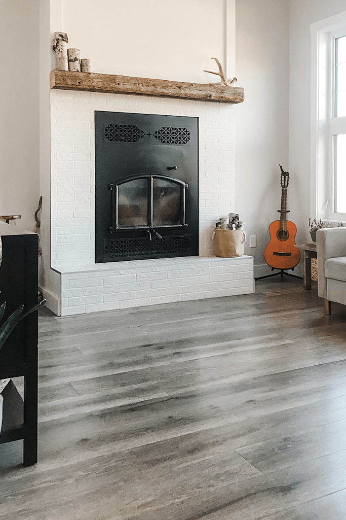
Even the direction certain windows in your home face will impact paint colors. For example, south facing windows will make the wall color look warmer. North facing windows will make the wall color look cooler. And on the topic of windows, the amount of natural light a room gets will also play a factor. For example the purple-grey color in my home actually looks lovely in my living room during the day because there is a TON of natural light.
How to Pick Paint Colors Step 4: Applying the Paint Colors to Your Home
If you’ve only chosen one color, then go ahead and start rolling away. However, if you’ve chosen a few different colors, you might still be stuck on how to apply them to your home.
My general advice is to use your lighter neutrals in spaces such as entryways, hallways and stairways. For kitchens and bathrooms I would use a medium-toned neutral or a light-medium color. You don’t want to go so light it shows all the muck that accumulates in these spaces, but I also like a lighter, brighter bathroom and kitchen space so I wouldn’t go too dark.
Living rooms, bedrooms – and offices too – are perfect opportunities to add in an accent wall. So I would pair a neutral with the darkest color you selected to add just a tiny bit of drama to the space.
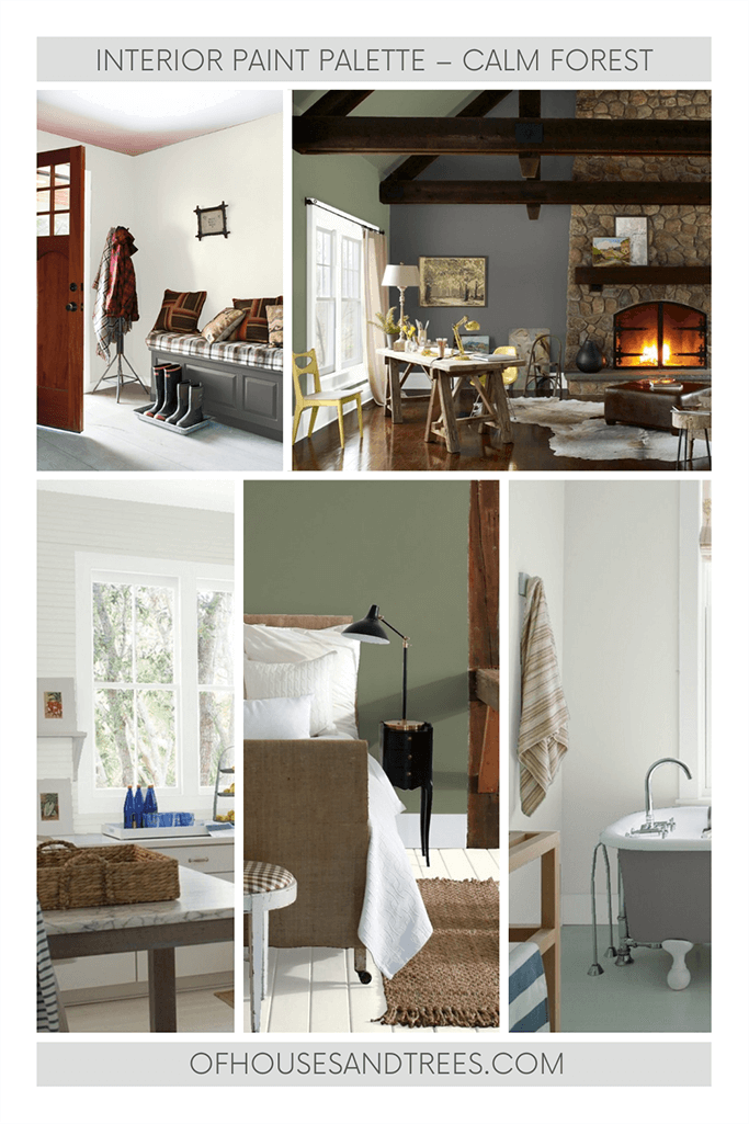
And there you have it! My extremely long and hopefully thorough step by step instructions on how to pick paint colors for your home.
Visit my Etsy shop to see all my ready-to-purchase paint palettes. You can also visit my Etsy shop by scanning this QR code:

(Create your own QR codes using Adobe’s free QR code tool!)
PIN ME!

Posted on January 10, 2021
Former architectural technologist. Current treehugger.
I’m here to help you green your home – and your life.
Subscribe to the Of Houses and Trees monthly newsletter and I’ll send you my FREE list of “The 8 Best Places to Buy Eco-Conscious Decor Online.”
What on earth is sustainable design? Learn all about this eco-focused design method and read the latest posts about green architecture, interior design and decor.
Sustainable living is more than just a thing treehuggers talk about. It’s about making conscious choices everyday. Read the latest posts on living with the planet’s wellbeing always in mind.
Visit the Of Houses and Trees sustainable product directory and support brands trying to make a difference in the world.
Find out more about our 40 acres of land in Parkland County, Alberta and the sustainable home we built amongst the trees.
Need help creating the home of your dreams? Care about the planet? You’ve come to the right place! check out my affordable, sustainable e-design services.
Having a had time choosing paint colours? I’ve got you – and your walls – covered with an interior paint palette sure to compliment your home.
Have questions about creating an eco-conscious home? Go ahead – ask me! Sign up for one of my free online interior design consultations and ask me anything you want.
